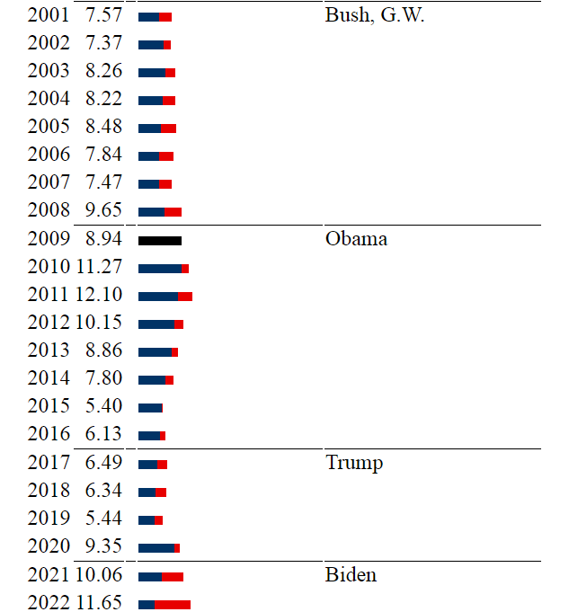
We’ve touched on the Misery Index before– it’s economic shorthand for how unpleasant things feel at any given time. Inflation added to unemployment, the higher, the more unpleasant.
One of the wonders of the internet is that there so often is “a website for that”. In the case of the misery index, it’s miseryindex.us, which allows you to look at the misery index by year, month, and president. The last two decades are represented as follows.
And- if you aren’t feeling the misery- here’s the link to the national debt clock (because there’s a website for that, too).

Leave a comment