I ‘ve been a free subscriber to Mary Pat Campbell’s substack for a while now. She’s an actuary – which is a bit more specialized than a demographer. A demographer has to know 3 things – births, migration and death. An actuary has just one topic – death. Still, actuaries are very good at their topic. This week, she got my attention with this graph:
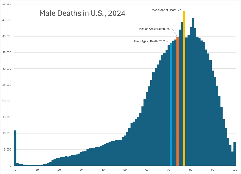
It’s quite a chart for a 75 year-old man to read – and note the columns she has emphasized – last year, for men, the mean age of death was 70.7, the median was 74, and the mode 77. As a brief explanation – the mean is the arithmetic average, the median is the middle value, and the mode is the most frequently occurring. Look at those numbers and think for a minute – for a guy who is 75, it isn’t surprising that it makes me feel infernally mortal. She’s still in her fifties, and female, so the chart isn’t nearly so personal for her. (She’s definitely worth reading and is at https://marypatcampbell.substack.com/p/rip-robert-redford-1936-2025-and?img=https%3A%2F%2Fsubstack-post-media.s3.amazonaws.com%2Fpublic%2Fimages%2F8c1e30b0-74f2-4108-a7a7-ed238182bd8a_3127x2268.png&open=false
She does a nice job in showing how to use cohort life expectancy for planning pensions, annuities, etc. If you have any interest at all in actuarial tables and planning, log onto her site and subscribe.

Leave a comment