Trego's Mountain Ear

"Serving North Lincoln County"

Category: Demography

  • Economic Drivers and Housing Shortages

    Economic Drivers and Housing Shortages

    Back in 1960, Lincoln County was timber, mining and farming.  There was a fairly stable population, jobs were available, and both small and large ranches.  Along with the Corps of Engineers planning Libby dam, and looking at flooding the lands near the Kootenai, by the middle of the decade our communities became boomtowns, needing housing for the newcomers who would be working on the tunnel, the railroad relocation, the highway relocation, and Libby dam itself. 

    I was in high school – and Dad was looking at a trailer court, pretty much where the trailer court is today in Trego.  His advantage in negotiating with the company that had the contract for the tunnel was me being in high school.  Gail Tisdell, a classmate  who worked at Lynn’s Cafe over lunch hour, kept me informed about the company honchos lunch table discussions.  Long story short, we wound up with a trailer court built pretty much to the specifications they brought in from San Mateo.  Jack Price put in a trailer court down by the substation.  Up the creek were two more: Westwood Acres and S&S.  All told, Trego went from being virtually trailer-free to about 200 spaces in the course of a year. 

    Likewise, when the tunnel and the railroad relocation ended, so did the largest trailer courts.  Across the county, we had a surplus of trailer spaces that would last for decades.  Many weren’t built to those California standards – I recollect septic tanks built from laminated cull 2×4’s.  The materials were cheap, the construction sub-marginal, and a place that had once housed 50 families emptied and left to collapse.

    A half-century later, watching the ads and listening to people looking for housing shows me that we’re in a new housing situation.  Kind of a 55-year cycle – in 1910, all it took to resolve a housing shortage was an axe, a crosscut saw, a froe and a chisel.  In 1965, the spirit of capitalism moved in to develop trailer courts across the county as labor boomed in construction projects.  Now, we’re looking at a county that the USDA Economic Research Service lists as Government dependent. 

    It says something when your county’s largest economic drivers are federal and state government employment – the definition is that over 14% of annual earnings are from federal or state government jobs.

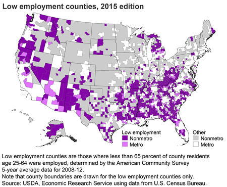
    Additionally, the ERS lists Lincoln county as a “low employment” county – and the definition is “less than 65 percent of county residents 25-64 were employed.”  The examples are often anecdotes instead of data – a friend from my youth, who hasn’t migrated out for work, explained that his highest paid years were in the seventies.  We’ve been migrating out for work, then returning, for several generations.  It makes a difference in the statistics. 

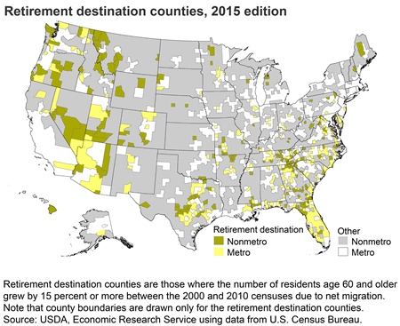
    If you note the classification as a retirement destination county – “where the number of residents age 60 and older grew by 15 percent or more between the 2000 and 2010 censuses due to net migration.”  Home building, home purchases, are a bit easier for folks who are moving in at the end of their careers.  Some of our retirees are returning.  Others, not originally from here, still have the same motivation – in both cases, “going home to a place he’d never been before” is somewhat appropriate.

    Anyway, watching the rental market shows that the world has changed.  An axe, saw and froe no longer combine with a strong back and a willingness to work to build a home.  There are safer, less regulated places for venture capital than building a lot of housing rapidly.  Young families compete with retirees – and it’s a lot easier to buy or build that second or third house when you’re holding the check for the house you sold in Oregon, or Washington, or California.

  • Life Expectancy Reported Down, with multiple reasons

    I’ve seen another release about the US life expectancy dropping a year during 2020 – but this one didn’t credit Covid exclusively.  It pointed out that the US Life expectancy has been dropping for several years due to an increase in drug overdoses and suicides.  Please remember – causality is inferred, not statistically proven.

    Covid, with most fatalities occurring among the the oldest, has a hard time reducing the life expectancy by a year. (Social Security has its work on life expectancy, going back to 1940, another table, for life expectancy at specific ages, is available at here)

    The article reminded me of the drop in life expectancy that followed the end of the Soviet Union.  That was credited to alcohol overdoses, violent death, and suicides.  The chart shows that it happened there, so it can happen here.  The thing about the calculated life expectancy is that one 21-year-old male death takes 55.91 years from the life expectancy chart, while a 75-year-old male death takes only 11.14 years from the collective pool.

    The Soviet figures suggest that a major economic or governmental change can have some immediate changes – though today’s Russians, who made it through the collapse of the Soviet Union were back on track in 2019.  CDC has released data showing excess US deaths in 2020, but they are by state and weekly.  Hopefully they will condense the data – 50 states and 52 weeks make a spreadsheet that takes a lot of effort to get through.  Summing up the data to one nation and one year will make it a lot easier to comprehend,  The data that is currently available is at this link.  It is interesting to look at – and I expect that they will have it compiled at a national level soon.

  • The Excess Death Data is Available from the CDC

    The Excess Death Data is Available from the CDC

    The Center for Disease Control has compiled and released the excess death data for 2020 that gives us a better handle on Covid.  The first charts give a bit of a handle on what was happening:

    There are a couple of interesting conclusions – first is that about a third of the excess deaths are not due to covid.  The second is that either the virus treats hispanic and black people different than whites, or that there are intervening variables or spurious correlations.  First, let’s look at the charts by age cohorts

    They confirm that Covid was a greater threat to older folks than younger – just like the statistics have been showing us. Next, let’s look at the charts by race and hispanic ethnicity:

    I’m not real sure about the relationship based on hispanic ethnicity – one of my colleagues qualifies as hispanic, but mostly Apache ancestry.  Gina is hispanic, but both parents were born in Spain.  Heck, genetically I have some Spanish or Portuguese ancestry, and my people otherwise come from Scotland and points north of there.  On the other hand, I’m waiting for the research that explains the extreme deaths in the category.

    The lower left chart shows that the disease did not hit the white population so hard – which intrigues me because that is the oldest of the groups.  I’ll be waiting for more data before I make any inferences.

    So click the link, read the CDC article, and start wondering – what hit us half as hard as covid at the same time?

  • Right Wing, Left Wing, Whole Bird

    This last election showed something around 155 million ballots cast for one candidate or the other.  I don’t know how many voters each candidate had – but the number of ballots seems like a solid chunk of data.  And there was a lot of name calling about extremists – whether it was proud boys, antifa, or whatever.  In my lifetime, I’ve met a few extremists from both the right wing and the left wing, and I figure we can grade on the bell curve – where 68% fits within a standard deviation of the mean (average).  I don’t believe I’m stretching reality if I arbitrarily claim you need to be two standard deviations from the mean to qualify as an extremist. 

    So, if we look at things from my bell curve perspective, 95 percent of the voters do not qualify as extremist.  68 percent are in the middle of the road, there are another 13 ½ percent to either side that qualify as, let’s call it, solidly partisan.  So if I’m at the hypothetical middle, I need to look over two standard deviations left or right to spot an extremist.  They aren’t that easy to see from the middle.  But if I’m standing at the edge of that 13 ½ percent I defined as solidly partisan, there are 2 standard deviations between me and that hypothetical average. 

    The problem is, we generally consider ourselves normal, but there’s a lot of difference under the bell curve:

    (images taken from https://www.mathsisfun.com/data/standard-normal-distribution.html  it’s a great explanation and worth reading the whole thing)

    Back to the election – most Trump voters, and most Biden voters fall into that central 68 percent – but our perception of extremists is dependent on where we sit on the bell – the number of standard deviations away from the norm.  If you’re still making facebook posts about the evils of Trump 6 weeks after he left office, you’re likely a standard deviation or two to the left of the norm.  If you’re still flying a Trump banner, you’re probably a standard deviation or two to the right.  It’s OK – the problem is when you forget where you are and start seeing normal folks as extremists.  As the man said, both wings are attached to the same bird.

  • Where Covid Fits in the Demographic Transition Model

    Where Covid Fits in the Demographic Transition Model

    The first stage of the demographic transition model includes high birth rates and high death rates – and infectious diseases dominate – for example, the black death was a highly infectious disease that killed millions in Europe – if memory serves, 60% of Venice died, and about a third of Italy’s population.  The 90% fatalities in Constantinople suggests that it was worse in cities.  A time of a life expectancy of around 30 years, because so many died young.  I’m not certain how effective the masks of the time were in combating the disease transmission.

    The second stage includes infectious diseases – such as cholera – that could be controlled by sanitation.  Models don’t always fit as well as we would like – at the same time that public health and improved sanitation was getting a handle on cholera, smallpox vaccination was becoming a norm.   It was 1832 when Congress passed the Indian Vaccination Act, ordering the army to vaccinate the Indians.  Typhoid Mary remains in our vocabulary, a woman who showed no outward sign of infection, but spread typhoid wherever she cooked.  In her case, she was basically incarcerated because of her infection (and she kept escaping).  Stage 2 of the demographic transition is characterized by fewer pandemics, and life expectancy may rise as high as 50 years.  Our masking, quarantines and isolation are public health techniques developed in the second stage of demographic transition.  John Snow’s removal of the Broad Street pump handle was very effective at reducing the waterborne cholera transmission.

    The third Stage is the stage of degenerative and man-made diseases – picture how cigarettes fit in with lung cancer and heart disease.  Just living longer increases your chances of dying from a degenerative disease.  Infant mortality drops, and life expectancy is pretty much in the mid-fifties.  The public health approach here is to change unhealthy behaviors like smoking while relying on medical research to counteract degenerative diseases.   The term “safe sex” comes from a public health program to reduce AIDS (HIV).  When it works, and it has, we move into the fourth stage of demographic transition.

    Stage 4 – where we are in the US today – shows an increase in degenerative diseases, better medical care, and a life expectancy that exceeds 70 years. 

    It is no wonder that Covid took everyone by surprise – in Stage 4, we’re used to having pandemics under some form of control – our top 3 causes of death are heart disease, cancer and accidents.  The Corona virus came in with an approach that complemented our stage in the demographic transition model – a pandemic that killed in a relationship to the age of the infected.  Probably the first clue was the word “comorbidity” becoming so much of the vocabulary.  This time we hit a pandemic that worked in combination with the degenerative diseases.  A disease that matches an aging population.  A disease that needed a stage 4 response.  Lacking that stage 4 response, we’ve spent the year responding as we did to diseases during the second stage of demographic transition.

    Another Stage 4 pandemic will develop – after all, we have a stage 4 population as an incubator.  We may even develop new strategies for dealing with it.

  • Death Rates by Country

    Death Rates by Country

    One of the more useful publications to compare nations is the CIA World Factbook.  While we tend to think of the CIA as secret agents, a lot of them are data geeks crunching numbers.  The data they develop about each country is impressive, and like the US Census, the CIA sets the standard for the most accessible and reliable information.  When I started using it, I needed a land-grant college library.  Now, I click World Factbook.

    National death rates in 2018 ranged from 19.3 per 1000 in South Sudan down to 1.6 per 1000 in Quatar.   The reasons vary – a higher median age (Japan is 48.36) combined with healthy living and good health care can still have relatively low death rates (Japan was 9.9 in 2018).  The explanation is Demographic Transition theory – in the old days we had high birth rates and high infant/youth mortality.  The second stage occurred with health care improvements – birth rates remained high, but death rates dropped.  Stage 3 showed lower birth rates and death rates continuing to drop, but more slowly.  The fourth stage maintains the lower birth rates, but in an aging population the diseases change – in the US, the big killers are heart disease and cancer.

    Lesotho, in Southern Africa, has the second highest death rate – high infant mortality (44.6 deaths per 1000 births), the world’s second highest HIV rate.  A dozen years ago, I first encountered https://www.worldlifeexpectancy.com/ and the website gets increasingly useful.  It isn’t that the covid is so insignificant in Lesotho, it’s that Diarrhea is so much more prevalent.  Click the link – and check out the demographic factors for your own country.  In the US, it shows life expectancy changes since 1960:

    US life expectancy from World Life Expectancy

    The personal computer has taken demography from being a science that need a major university’s library facilities in my undergraduate days into being a science with the data available to a Fortine resident who has insomnia at 3:00 am.