Trego's Mountain Ear

"Serving North Lincoln County"

Category: A Science for Everyone

  • The Spin on Rifling

    I watched a video of a 9mm being fired into a pond’s ice surface, and the bullet spinning like a top.  It’s an experiment that I don’t plan to duplicate, since my feet have enough problems without doing something dumb – but the video does lead in to an explanation of rifling.  The gun handling is not exemplary – but the results are worth watching.

    I am not an expert on firearms – but during the middle of the 1980’s, I was tasked with developing a class that brought gunsmithing students toward computer literacy.  It was a time when personal computers and I were young – and the work assignment gave me a great learning opportunity, as well as teaching.

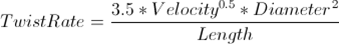
    It’s common knowledge that rifling – the twisting grooves inside the barrel – cause the bullet to spin, and that spinning the bullet increases accuracy.  If you take that knowledge, and go to the tables that show rate of twist for rifling in specific calibers, and couple that with the tables on muzzle velocity, you can come up with some absolutely fascinating numbers.  Rifling Twist Rate is a good article by Chuck Hawks on the topic.

    One of the problems I shared with my students was determining how many revolutions per minute the bullet from my 1903A3 Springfield was making, when I fired a 30/06 accelerator.  This required the students to find the muzzle velocity of the cartridge (listed at 4,000 feet per second, and the rate of twist in the Springfield (1 turn in 10 inches – and not ideal for match use).

    If you’re willing to look at RPM at the muzzle, the math is straightforward – one turn in ten inches is 1.2 turn in a foot – so, as the bullet leaves the muzzle, it’s spinning 4800 revolutions per second.  Multiply that by 60 seconds in a minute and you’re left with a 55 grain bullet spinning at 288,000 RPM. 

    It doesn’t take a rocket scientist to realize that something spinning that fast really wants to come apart.  It’s part of the reason ammunition manufacturers make different types of bullets – not everything is expansion.  During the War Between The States, the rate of twist for rifled muskets was somewhere between one turn in 48 inches and one turn in 72 inches – which provided pretty good accuracy for those 58 caliber beasts.  Muzzle velocity was around 900 feet per second – which, with a 72 inch twist gives 150 turns per second, or 9,000 RPM.  The spin was slow enough that a lead bullet could hold together easily.

    Years ago, I spoke with a gun expert who had a 17 Remington – she didn’t like recoil and explained that her rifle substituted speed for bullet weight.   It’s another 4000 ft per second rifle – and the twist is 1 turn for 9 inches – 300,000 RPM in a 25 grain hollow point projectile.  Since I could do math, and she was certain of her expertise, there was no point in further discussion.   If she’s happy, she has a better deer rifle than I (or you, for that matter).

    The empirical equation for rifling is (from Hawk):

    While we don’t have exact numbers for the bullet in the video, 9mm barrels range between 10” twist and 18 and a fraction.  Since I’m ballparking, let’s assume 12” twist and a muzzle velocity of 1,000 feet per second.  The bullet would have hit the ice spinning at 60,000 rpm.  Small wonder that it spun like a top – but I won’t duplicate the experiment, and I recommend no one else does either.

  • Snow Pack on March 1

    The long-term average for snow surveys were dated for the first of the month when I started measuring snow 45 years ago.  The old guys did it the hard way – up Burma Road early, skis or snowshoes to the Weasel Cabin, build a fire, sample the snow course, then overnight.  The next day they would head down the creek, then climb Stahl, build a fire, sample the snow course, then hike out the next morning, sample the course at Grave Creek, hike the rest of the way out and finish the job driving the pickup out.  As a modern, I drove a snowmobile and did 3 snow courses in a day.  Now I click a link on the home computer, and can look at the whole basin’s information in minutes.

    The numbers from March 1 were kind of sacred – there had been enough winter that Jay Penney felt safe projecting the data – enough was in that he would comment that the snowpack was light, normal or heavy.

    These are some of the snow courses I measured in those middle days, when we thought a snowmobile was absolutely modern, and were experimenting with measuring snow water at Noisy Basin with a radioactive source and receiver.  We were state of the art back then.     

    ElevationWater EquivalentPercent of Average
    Banfield Mountain5600 feet13.1 inches88%
    Hawkins Lake6450 feet18.9 inches94%
    Garver Creek4250 feet8.4 inches101%
    Stahl Peak6030 feet24.4 inches86%
    Grave Creek4300 feet13.1 inches87%
    Poorman Creek5100 feet29.4 inches95%
    Bear Mountain5400 feet45.6 inches87%
    Hand Creek5035 feet9.2 inches102%
    Noisy Basin6040 feet31.5 inches106%
    To get to the data – and the map – you just click https://www.nwrfc.noaa.gov/snow/ . Making the data so available makes hydrology a science for everyone.
  • Where Covid Fits in the Demographic Transition Model

    Where Covid Fits in the Demographic Transition Model

    The first stage of the demographic transition model includes high birth rates and high death rates – and infectious diseases dominate – for example, the black death was a highly infectious disease that killed millions in Europe – if memory serves, 60% of Venice died, and about a third of Italy’s population.  The 90% fatalities in Constantinople suggests that it was worse in cities.  A time of a life expectancy of around 30 years, because so many died young.  I’m not certain how effective the masks of the time were in combating the disease transmission.

    The second stage includes infectious diseases – such as cholera – that could be controlled by sanitation.  Models don’t always fit as well as we would like – at the same time that public health and improved sanitation was getting a handle on cholera, smallpox vaccination was becoming a norm.   It was 1832 when Congress passed the Indian Vaccination Act, ordering the army to vaccinate the Indians.  Typhoid Mary remains in our vocabulary, a woman who showed no outward sign of infection, but spread typhoid wherever she cooked.  In her case, she was basically incarcerated because of her infection (and she kept escaping).  Stage 2 of the demographic transition is characterized by fewer pandemics, and life expectancy may rise as high as 50 years.  Our masking, quarantines and isolation are public health techniques developed in the second stage of demographic transition.  John Snow’s removal of the Broad Street pump handle was very effective at reducing the waterborne cholera transmission.

    The third Stage is the stage of degenerative and man-made diseases – picture how cigarettes fit in with lung cancer and heart disease.  Just living longer increases your chances of dying from a degenerative disease.  Infant mortality drops, and life expectancy is pretty much in the mid-fifties.  The public health approach here is to change unhealthy behaviors like smoking while relying on medical research to counteract degenerative diseases.   The term “safe sex” comes from a public health program to reduce AIDS (HIV).  When it works, and it has, we move into the fourth stage of demographic transition.

    Stage 4 – where we are in the US today – shows an increase in degenerative diseases, better medical care, and a life expectancy that exceeds 70 years. 

    It is no wonder that Covid took everyone by surprise – in Stage 4, we’re used to having pandemics under some form of control – our top 3 causes of death are heart disease, cancer and accidents.  The Corona virus came in with an approach that complemented our stage in the demographic transition model – a pandemic that killed in a relationship to the age of the infected.  Probably the first clue was the word “comorbidity” becoming so much of the vocabulary.  This time we hit a pandemic that worked in combination with the degenerative diseases.  A disease that matches an aging population.  A disease that needed a stage 4 response.  Lacking that stage 4 response, we’ve spent the year responding as we did to diseases during the second stage of demographic transition.

    Another Stage 4 pandemic will develop – after all, we have a stage 4 population as an incubator.  We may even develop new strategies for dealing with it.

  • Death Rates by Country

    Death Rates by Country

    One of the more useful publications to compare nations is the CIA World Factbook.  While we tend to think of the CIA as secret agents, a lot of them are data geeks crunching numbers.  The data they develop about each country is impressive, and like the US Census, the CIA sets the standard for the most accessible and reliable information.  When I started using it, I needed a land-grant college library.  Now, I click World Factbook.

    National death rates in 2018 ranged from 19.3 per 1000 in South Sudan down to 1.6 per 1000 in Quatar.   The reasons vary – a higher median age (Japan is 48.36) combined with healthy living and good health care can still have relatively low death rates (Japan was 9.9 in 2018).  The explanation is Demographic Transition theory – in the old days we had high birth rates and high infant/youth mortality.  The second stage occurred with health care improvements – birth rates remained high, but death rates dropped.  Stage 3 showed lower birth rates and death rates continuing to drop, but more slowly.  The fourth stage maintains the lower birth rates, but in an aging population the diseases change – in the US, the big killers are heart disease and cancer.

    Lesotho, in Southern Africa, has the second highest death rate – high infant mortality (44.6 deaths per 1000 births), the world’s second highest HIV rate.  A dozen years ago, I first encountered https://www.worldlifeexpectancy.com/ and the website gets increasingly useful.  It isn’t that the covid is so insignificant in Lesotho, it’s that Diarrhea is so much more prevalent.  Click the link – and check out the demographic factors for your own country.  In the US, it shows life expectancy changes since 1960:

    US life expectancy from World Life Expectancy

    The personal computer has taken demography from being a science that need a major university’s library facilities in my undergraduate days into being a science with the data available to a Fortine resident who has insomnia at 3:00 am. 

  • Windchill

    Windchill

    It’s not really that cold out, is it?

    Are you asking the thermometer? To a chemist or a physicist, temperature is really just a measure of how fast the molecules that make up air are moving, how much energy they have.

    To those of us more interested in what the thermometer says outside, temperature has more to do with the rate at which we exchange heat with the environment. At the same temperature, a metal spoon will feel hotter than a wooden one; The metal spoon, being metal and thus more conductive exchanges heat with us at a faster rate, and so feels hotter.

    Cold works the same way. The faster we lose heat, the colder it feels, even if the reading on the thermometer hasn’t gone down any.

    Windchill, then, has to do with the way wind changes the rate at which we exchange heat with the air around us, specifically the rate at which we lose heat.

    It makes an obvious sort of sense. The more wind, the more particles of air move by us, the more opportunities for particles of air to get a little warmer and us to get a little colder. But it’s actually worse. Wind will strip away that nice little layer of air you’ve already exchanged some heat with. It’s slightly warmer (which means its taking slightly less of your heat) and keeping all that really cold air from touching your skin. Insulating. Wind strips away that insulating layer of air.

    Windchill, while ostensibly a measure of how cold it feels, is really a measure of heat loss. At it turns out, your body cares far more about how cold it feels than how cold the thermometer reads. While your skin temperature isn’t going to drop below ambient temperature, your body will perceive things as colder than they are, and respond accordingly. Frostbite? Hypothermia? The symptoms of those are the result of the body responding to how cold it feels.

    Thirty degrees and windy can’t actually drop your skin’s temperature below thirty, but it’ll feel colder, and that is enough to increase the risk of cold related injury such as frostbite. While the equations to calculate windchill vary a bit, windchill warnings are serious business.

    It’s not really that cold out, is it? Not if you ask the thermometer. If you’re asking me, however…

  • Inflation

    Inflation is one of the very basic, very important economic concepts. It is deceptively simple. Increase the supply of money, and it’s like inflating a balloon. The amount of air in the balloon increases, the amount of money in the system increases. This is essentially what happens whenever the government prints more money.

    When the amount increases, the value of each individual unit goes down. This becomes more difficult to understand, because a dollar is still a dollar. However, a dollar doesn’t purchase as much.

    Think back. Remember. How much was gasoline ten years ago? Twenty? Thirty? But it’s not always the price that increases. Sometimes, the amount goes down. Candy-bars, anyone? They’ve shrunk considerably since I was a child admiring them in the checkout isle. Of course, some things increase in efficiency and decrease in price, even while others do the opposite. Why? Developing technology can really reduce the costs of making something, sometimes enough that the price declines, even as the value of money goes down.

    The federal reserve aims for an inflation rate of 2%. But that’s a number with very little meaning to most people. We care more about how much the grocery bill will increase by. For that, we look at the consumer price index. Calculating how much the value of money has changed is as simple as having two reference points. Pick an item. What does it cost today? What did it cost back then? Do a little subtraction, and then a little division.

    Of course, you could also use the CPI inflation calculator provided by the government. In that case, it told me that a 100$ in 1920 had the same purchasing power as $1,342.65 in 2020.

    Why do we care about inflation? Sure, groceries cost more, gas costs more, electricity costs more, but we’re earning more too, right? Eventually, probably. What’s really concerning is when inflation is high, when you see the kind of chance the US dollar had from 1920 to 2020 over the course of a year. Wages just can’t keep up.

    Literally printing more money, while the obvious (and easiest) means of causing inflation, isn’t the only way to go about it, but the alternatives are a bit complex for this summary.