Trego's Mountain Ear

"Serving North Lincoln County"

Category: A Science for Everyone

  • Fires by Year and Partial Duration Series

    Fires by Year and Partial Duration Series

    When I listened to the explanations that the California and Oregon fires were worse than ever, and resulted from anthropic climate change, I did what I usually do.  I checked for data and found statistics at the National Interagency Fire Center.

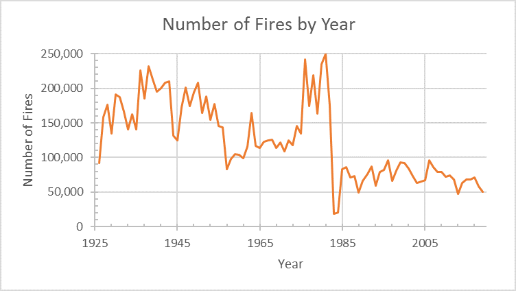
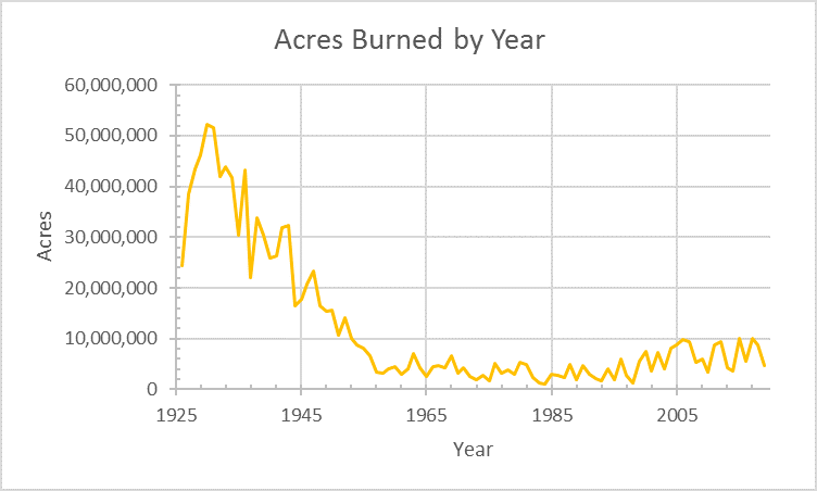
    The table I found lists both number of fires, and acreage burned by year, starting in 1926. That’s almost a hundred years, and a lot of numbers. Since graphs tend to easier to read, line graphs follow. The drop in number of fires in 1984 is a dramatic shift, The drop in acreage burned that occurred in the fifties is an equally dramatic shift.

    Number of Fires, by Year, in the United States. Data from the National Interagency Fire Center

    Both sets of data are partial duration series – and a significant part of my life has been making projections from partial duration series, and teaching how to do it. Not predicting the future, you understand just projecting the data. It would have been nice to have this data for the classroom – you can see how taking either the left half of the graph, or the center half, or the right half, and projecting a line through it, would lead to very different projections.

    Our largest years for fires were pretty much between 1926 and 1952.  I had remembered 1988 as particularly bad – but the statistics show that it was perspective – Yellowstone Park burned, then at the end of the year, Dry Fork was almost in the backyard.  Five million acres burned is a lot – but compared to 52 million in 1930, it seems small. Memory is influenced by perspective, and my memory of the 1988 fire season was “Montana-centric.”

    Acres Burned, by Year, in the United States. Data from the National Interagency Fire Center

    The graphs look very different if you cut the data down to just 20 years. Most of the time, our data is a partial duration series. Tweaking reality from a partial duration series isn’t always easy – and the past century’s forest fire data shows the challenges. The projection can’t be better than the data.

  • America’s First Plagues

    I wound up studying epidemics when I was given the task of teaching Indians of North America.  The data was limited, but pretty much irrefutable – European diseases, brought by ship to the islands and eastern coast of North America did far more than decimate the native population of the Americas.

    By the end of my readings, I pretty much bought into Dobyns’ explanation: “Before Europeans initiated the Columbian Exchange of germs and viruses, the peoples of the Americas suffered no smallpox, no measles, no chickenpox, no influenza, no typhus, no typhoid or parathyroid fever, no diphtheria, no cholera, no bubonic plague, no whooping cough and no malaria.”

    His research leads to the conclusion that European diseases race across the continent ahead of the European explorers, killing 80 to 95% of the population.

    I settled for that explanation, until Covid statistics started to overwhelm me, then realized, I could take to the internet to find the R0 numbers for each of these diseases – and that those numbers would have been worse for virgin soil epidemics within a people who had no previous exposure.  R0 quantifies a germ’s ability to infect – the R0 for the 1918 Spanish Flu is estimated at 1.4 to 2.8, while the similar 2009 H1N1 was between 1.4 and 1.6.  Simply enough, the larger the R0 number, the more infectious the disease.

    R0 for Covid was estimated at 5.7 by the CDC.

    The lazy man’s way of capturing the R0 values is wikipedia. It shows:

    DiseaseR0
    Measles12-18
    Chickenpox10-12
    Mumps10-12
    Polio5-7
    Pertussis5.5
    Smallpox3.5-6

    As I looked at the data – often from Winter counts – I realized that Measles was likely at least as responsible for Native deaths as Smallpox, though the Native records really don’t distinguish. At any rate, the R0 provides a usable measure for understanding the unintended European  plagues had on the Native American populations.  Likewise, the chart lets me look back on my childhood diseases with a greater understanding of how virulent the diseases we encountered in the fifties actually were.

    R0 provides a good way of ranking how infectious a disease can be. Wiki also provides a chart for fatality rates of many diseases.

  • If LCHS District were a County

    After the article on searching Lincoln County data, the question came in: “What if North Lincoln County was its own county?”  The answer is available, but it takes the sort of personality that enjoys digging through data.  Here’s a few facts that would describe the thought experiment that would be county 57.

    County 57, sharing boundaries with the Lincoln County High School District, would rank 31st in population of Montana’s 57 counties (6,260 residents).  The remainder of Lincoln County would drop from the tenth largest population (19,980) to twelfth (12,694 residents). Data from 2010 Census and, of course, will likely change with completion of the 2020 Census. 

    Looking at market and taxable valuations we find that High School District 13 (LCHS) has a market value set at $1,202,098,056 and taxable valuation set at $17,042,130.  By my count, and this is the type of sort where it is easy to miss something, County 57 would have market and taxable valuations larger than 17 Montana counties. 

    The same source shows that Lincoln County’s market valuation is $2,741,812,498 and taxable valuation is $37,491,358.  44 Montana counties show lower market values than Lincoln County – not a great variance from the population rank.  County 57 would be 22nd in market valuation.  The remainder of County 56 – consisting of Troy and Libby High School districts, would be 21st.

    A more detailed study might include roads, total area, access to county services and a number of other items.  For a simple, “what if” analysis, looking at population and market value seems adequate.

  • Beer Taxes North and South

    I listened to a comment from north of the line about how cheap beer is south of the 49th parallel.  So I decided to investigate – and a lot of the difference is alcohol prices is the governmental controls.  Taxes do make a difference in what we drink – particularly when we look at alcoholic beverages. 

    A 2018 report titled “Beer Taxes – A Canadian – U.S. Comparison” makes the research easy.  “Beer taxes in Canada are higher in both absolute value and when calculated as a percentage of selling price with an average government beer tax percentage of 47% (of retail price) in Canadian provinces versus an average government tax percentage of 17% in U.S. states.”  Working the math is an exercise in keeping your units straight.    In Canadian dollars, a case of beer is $2.09 taxes in Montana, and $17.32 in British Columbia.  

    Montana taxes beer at 14 cents/gallon, Wyoming at just 2 cents/gallon, and Tennessee at $1.29/gallon. It’s a little harder to calculate the Federal taxes on beer:  $3.50 per barrel on the first 60,000 barrels for domestic brewers producing fewer than 2 million barrels annually; or $16 per barrel on the first 6 million barrels for all other brewers and all beer importers; and $18 per barrel rate for barrelage over 6 million. Wikipedia assures me that there are 31 gallons in a barrel of beer.  So we’re looking at 72 cents on the gallon of a big producer’s beer going for taxes in Montana, while craft beers from small brewers are a little more than a dime per gallon. 

    Essentially, every time you buy a beer north of the line, you buy a beer for the government.  South of the line, every time you buy a six-pack, you buy one for the government.

    Next week – taxation of hard liquor differences.

  • Musical Life Expectancy

    Musical Life Expectancy

    Over 20 years ago, a study was published about the life expectancy of saxophone players. It found that playing saxophone correlated positively with a significantly shorter life expectancy, and suggested that it might be caused by circular breathing and posture – but the data just showed correlation.  Of course, regardless of the quality of statistical data, causation is inferred.

    A 2015 article from the Conversation showed differing life expectancies for different styles of music.  The graph was impressive:

    It looks like jazz and blues are the healthiest genres, while Rap musicians tend to die young.  Still, the graph misses an important element – time.  Rap and Hip Hop started in the seventies, while Blues started a century earlier, and Jazz wasn’t far behind.   The data are skewed, and it isn’t surprising that Blues musicians have lived longer than Rap musicians.  It’s hard to be an old dead musician in the newest genre.

    Music and Longevity (2014) looks at the mean age at death of nearly 9,000 musicians, and concludes that harpists live longer (average 80.9) and guitarists have the shortest life expectancies (54.4).  Still, looking at the data, Zharinov and Anisimov included 32 harpists and only 9 guitarists. 

    I know a lot more guitar players than harpists, so either the sample is skewed or Keith Richards longevity is normal for guitarists. 

  • Talking about Risk

    A headline read, “What if we could live for a million years?”  My casual answer was “not a chance.”  Even if we could eliminate aging and disease, we still have to consider risk.  The National Safety Council reports 1.25 deaths for every 100 million miles of highway travel.  Assume 10,000 miles per year of highway travel, in the first thousand years of life, you’re up to 10 million miles.  That turns out to be a 1 out of 8 chance of dying – just from highway transportation.  The National Geographic gives odds of being struck by lightning as 1 in 700,000 each year, and one in 3,000 over a lifetime.  Increase the lifetime to that same 1,000 years, and the odds go up.  We live in a risk society, and often ignore that fact. 

    I know a guy who survived a grizzly mauling, and I’ve known one who died from wasp stings.  Even in Trego, I encounter more wasps than bears.  CDC stats show 89 people who died from bee stings in 2017.  It isn’t a large risk – but 80% of the fatalities are male.  Bee stings are a greater risk to the male half of the population. 

    Just about every endeavor includes misunderstood risks.  In 2018, the police fatality rate was 13.7 per 100,000 (bureau of labor and statistics).  CDC shows the 2017 fatality rate for farmers was 20.4 per 100,000.  BLS shows a rate of 132.7 per 100,000 loggers in 2015.  CDC shows bartenders have a higher on job fatality rate than police.  In some places policing is a relatively risky job – but in farm country and logging country it seems fairly safe.  Here’s the link to more data if this interests you.

    When we started looking a Covid-19, we didn’t have the statistical data to calculate risk.  Now, we do have some data – and we’re seeing disagreements, mostly because folks see risks differently.  As I write, RealClearPolitics shows 5,746,272 confirmed cases in the US, and 177,424 deaths, yielding a 3.09% confirmed case fatality rate.  Still, that number goes from 8.25% in New Jersey to 0.79% in Utah.  We have solid numbers – but not numbers that allow us to calculate risk.  When we look at the charts that include age, we can begin to calculate risk – 70 is higher risk than 40.  80 is even higher.  New York numbers suggest that dense populations and public transportation increase risk – but not enough to calculate. 

    The numbers let us develop ordinal data about covid risk – ranking things as more or less, rather than develop statistical data.  At 70, I’m at more risk than someone who is 50. The age data is good enough to develop some statistics – but the comorbidities that make it covid fatal mask that. Riding mass transportation is more dangerous than driving a car alone.  The virus doesn’t differentiate between bars and churches – open spaces are safer than crowded enclosed spaces.  So far we know that Covid is a bit more infectious than flu, and less infectious than measles.  Ordinal data. Buzz Hollander, a physician in Hawaii, has a good, readable article on covid at this site