Trego's Mountain Ear

"Serving North Lincoln County"

Tag: Covid-19

  • Have You Two Been Vaccinated?

    Have You Two Been Vaccinated?

    In the past couple of weeks, Renata and I have been asked “Have you been vaccinated?” by several different people.  Now I don’t mind saying yes – but I’m not sure that the question really is what it sounds like.  I think the question is “Can we visit your place with certainty that we won’t catch covid?”  Perhaps the question is “Have you been immunized?” 

    Vaccinated and immune have two different meanings.  The history of smallpox vaccination shows the differences over a thousand-year timeline.  The first vaccinations recorded are in China, after 1000 CE.  They’d grind up the scabs from someone with smallpox, and blow the dust into your nostrils – along with something like a 2% mortality rate.  Since the death rate from smallpox was about 30%, it seemed like a decent risk.  This practice was variolation, not vaccination.

    This development was state of the art until Jennings developed vaccination about 800 years later.   You remember, he took matter from the sores on a cow that had cowpox and injected it into people.  The latin word for cow – vacca – became the root of the word “vaccination.”  Since cowpox wasn’t smallpox, it took the risk of death down to about zero – but the minimal controls of the early 19th century kept the effectiveness down.  Jennings methodology didn’t guarantee the inoculation actually included cowpox.   Even as smallpox was eradicated, the vaccine was only 95% effective – but a 95% effective vaccine wiped out smallpox. 

    Life is a game of percentages – the only certainty is death . . . but we don’t know when.  When my colon cancer was diagnosed in May, 2009, the prediction was June, 2012.  The prediction changed when Rick Holm convinced his colleagues to humor me and look at the 2002 chest X-rays.  Just old scars, no new metastasis.  It changed the diagnosis from stage 4 to early stage 3.  All from looking at one 7 year-old X-ray. 

    CDC says my two doses of Pfizer should be 84% effective.  Israel’s health ministry rates it at 39%.   Personally, even 39% effective is worth getting the vaccine – I have made a point of getting flu shots that were no more effective.  But the answer to “Have you been vaccinated?” isn’t really a simple yes or no if the question is actually “Have you been immunized?”

    I think my friends are happier visiting with the knowledge I’ve been vaccinated, and not knowing the percentage effectiveness.  Vaccinated generally translates to less chance of getting sick – but few vaccines are 100% effective.  The recent infectiousness of this last covid outbreak has demonstrated that vaccination is not synonymous with immunization. 

  • CDC Data Visualization

    CDC Data Visualization

    Raw data is nice, but can be hard to visualize.  The CDC link at the bottom provides the data, but also a variety of ways to view it in chart and graph formats.  As the saying goes, past performance does not guarantee future results – but it isn’t a bad guideline.

    https://data.cdc.gov/NCHS/AH-Provisional-COVID-19-Death-Counts-by-Age-in-Yea/3apk-4u4f
  • Other Vaccine Effectiveness

    I got the Covid vaccine as soon as I could.  I think I might have been vaccinated earlier but for the manner in which the local government picked folks to vaccinate – I wasn’t sitting by the phone when the call came in, and that healthy, outdoors behavior put me a couple weeks later than I wanted.

    I’m one of the people who was in line for the polio vaccine – and it wasn’t far out of the experimental stage.  A classmate who is with you in kindergarten one day, then gone, and the dread word polio makes for a willingness to step up for vaccination.  As a kid, I didn’t know that the Salk vaccine was only 65% effective against one strain, and about 90% effective against the others.  Multiplication and division were still challenges back then – but I got the vaccine.

    I don’t need a perfect vaccine – the vaccine is to improve my odds.  I get flu vaccinations, and the table from CDC https://www.cdc.gov/flu/vaccines-work/past-seasons-estimates.html shows how that works.   The important part is “Adjusted Overall VE (%)

    Table. Adjusted vaccine effectiveness estimates for influenza seasons from 2004-2018

    CDC calculates vaccine effectiveness estimates through the U.S. VE Network

    Influenza SeasonReferenceStudy Site(s)No. of PatientsAdjusted Overall VE (%)95% CI
    2018-19Flannery 2020 WI, MI, PA, TX, WA3,2542921, 35
    2017-18Rolfes 2019 WI, MI, PA, TX, WA8,4363831, 43
    2016-17Flannery 2019 WI, MI, PA, TX, WA74104032, 46
    2015-16Jackson 2017 WI, MI, PA, TX, WA68794841, 55
    2014-15Zimmerman 2016 WI, MI, PA, TX, WA93111910, 27
    2013-14Gaglani 2016 WI, MI, PA, TX, WA59995244, 59
    2012-13McLean 2014 WI, MI, PA, TX, WA64524943, 55
    2011-12Ohmit 2014 WI, MI, PA, TX, WA47714736, 56
    2010-11Treanor 2011 WI, MI, NY, TN47576053, 66
    2009-10Griffin 2011 WI, MI, NY, TN67575623, 75
    2008-09UnpublishedWI, MI, NY, TN67134130, 50
    2007-08Belongia 2011 WI19143722, 49
    2006-07Belongia 2009 WI8715222, 70
    2005-06Belongia 2009 WI34621-52, 59
    2004-05Belongia 2009 WI76210-36, 40

    The important thing is that, in 15 years of data, the best record the vaccine had was 60% effectiveness.  The worst was down to 10% effectiveness.  If I’m playing blackjack, and I can get a 10% edge, that’s good.  If I can get a 60% edge, that’s great.  I don’t expect a vaccine -particularly one that had a rushed development-  to be 100%.

    Smallpox was ended with a vaccine that was about 95% effective – “Effective smallpox vaccines have a vaccinia titer of approximately 108 pock-forming units per mL, and more than 95% of individuals develop a ‘take’ with neutralizing antibodies after primary vaccination. “ It’s worth remembering that it took several centuries to develop that vaccine.

    Vaccines are more a statisticians game, or a gambler’s science.  Today’s polio vaccine is about as close to 100% effective as you can get.  The vaccines aren’t magic bullets – but they are better bullets.  It may take a while – but I’m betting the Coronavirus vaccines will become increasingly effective.  The problem is that the scientists are working on better vaccines, and politicians and administrators are working on press releases.

  • A Covid Risk Calculator

    Johns Hopkins has a covid mortality risk calculator that is both interactive and online: https://covid19risktools.com:8443/riskcalculator 

    Remember, I like statistics and correlations, and covid has provided a bit of an enigma since the data came out from the Diamond Princess outbreak last year.  This calculator takes in age, health and location and coughs up your probability of dying from covid.

    My own numbers were reassuring – I answered the questions . . . age 71, height, weight, history of asthma, cancer and diabetes, and the model churned out that I was 1.1 times as likely to die of covid as the model’s norm.  Essentially I was at a normal risk.  The analysis was:

    “Based on the information you have provided, the tool estimates that you have 1.1 (95% CI: 0.95 – 1.3 ) times the risk of dying from COVID-19 compared to the average risk for the US population.

    Based on the estimated risk, you are categorized to be at Closer to or lower than average risk based on the following chart:

    Further, based on the information available from pandemic projections in your state of residence, the tool estimates an absolute rate of mortality of 0.6 (95% CI: 0.3 – 1.3 ) per 100000 individuals in subgroups of the population with a similar risk profile to yours during the period of 05/15/2021 – 06/04/2021. This estimate is calculated based on the CDC’s Ensemble mortality forecast data.

    *95% CI: Error bounds with 95% confidence.”

    It’s a model – and only as good as the data that went into its development.  That said, Johns Hopkins has a pretty good reputation, and I would guess they will continue to refine the model.  Scientific method and statistical analysis do not allow perfect data for the individual.  That said, I like having a model that I can use.  Give it a try with your own data.

  • Life Expectancy Reported Down, with multiple reasons

    I’ve seen another release about the US life expectancy dropping a year during 2020 – but this one didn’t credit Covid exclusively.  It pointed out that the US Life expectancy has been dropping for several years due to an increase in drug overdoses and suicides.  Please remember – causality is inferred, not statistically proven.

    Covid, with most fatalities occurring among the the oldest, has a hard time reducing the life expectancy by a year. (Social Security has its work on life expectancy, going back to 1940, another table, for life expectancy at specific ages, is available at here)

    The article reminded me of the drop in life expectancy that followed the end of the Soviet Union.  That was credited to alcohol overdoses, violent death, and suicides.  The chart shows that it happened there, so it can happen here.  The thing about the calculated life expectancy is that one 21-year-old male death takes 55.91 years from the life expectancy chart, while a 75-year-old male death takes only 11.14 years from the collective pool.

    The Soviet figures suggest that a major economic or governmental change can have some immediate changes – though today’s Russians, who made it through the collapse of the Soviet Union were back on track in 2019.  CDC has released data showing excess US deaths in 2020, but they are by state and weekly.  Hopefully they will condense the data – 50 states and 52 weeks make a spreadsheet that takes a lot of effort to get through.  Summing up the data to one nation and one year will make it a lot easier to comprehend,  The data that is currently available is at this link.  It is interesting to look at – and I expect that they will have it compiled at a national level soon.

  • The Excess Death Data is Available from the CDC

    The Excess Death Data is Available from the CDC

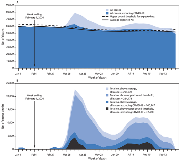
    The Center for Disease Control has compiled and released the excess death data for 2020 that gives us a better handle on Covid.  The first charts give a bit of a handle on what was happening:

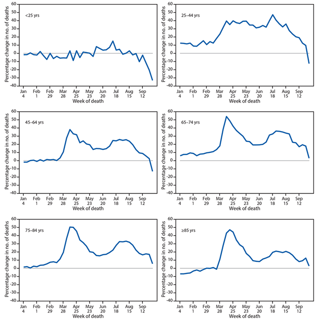
    There are a couple of interesting conclusions – first is that about a third of the excess deaths are not due to covid.  The second is that either the virus treats hispanic and black people different than whites, or that there are intervening variables or spurious correlations.  First, let’s look at the charts by age cohorts

    They confirm that Covid was a greater threat to older folks than younger – just like the statistics have been showing us. Next, let’s look at the charts by race and hispanic ethnicity:

    I’m not real sure about the relationship based on hispanic ethnicity – one of my colleagues qualifies as hispanic, but mostly Apache ancestry.  Gina is hispanic, but both parents were born in Spain.  Heck, genetically I have some Spanish or Portuguese ancestry, and my people otherwise come from Scotland and points north of there.  On the other hand, I’m waiting for the research that explains the extreme deaths in the category.

    The lower left chart shows that the disease did not hit the white population so hard – which intrigues me because that is the oldest of the groups.  I’ll be waiting for more data before I make any inferences.

    So click the link, read the CDC article, and start wondering – what hit us half as hard as covid at the same time?